Web Design Trends for 2019
From a web design perspective, a lot has happened in 2018! From the usual changes (like another round of Adobe updates), to unexpected surprises (like another new Uber identity), website designers have explored lots of new and interesting ideas. In this article, we’ll take a look at six trends with lots of traction heading into 2019, with a simple overview, analysis, and examples for each.

A - All the Colors
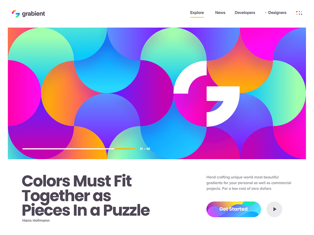
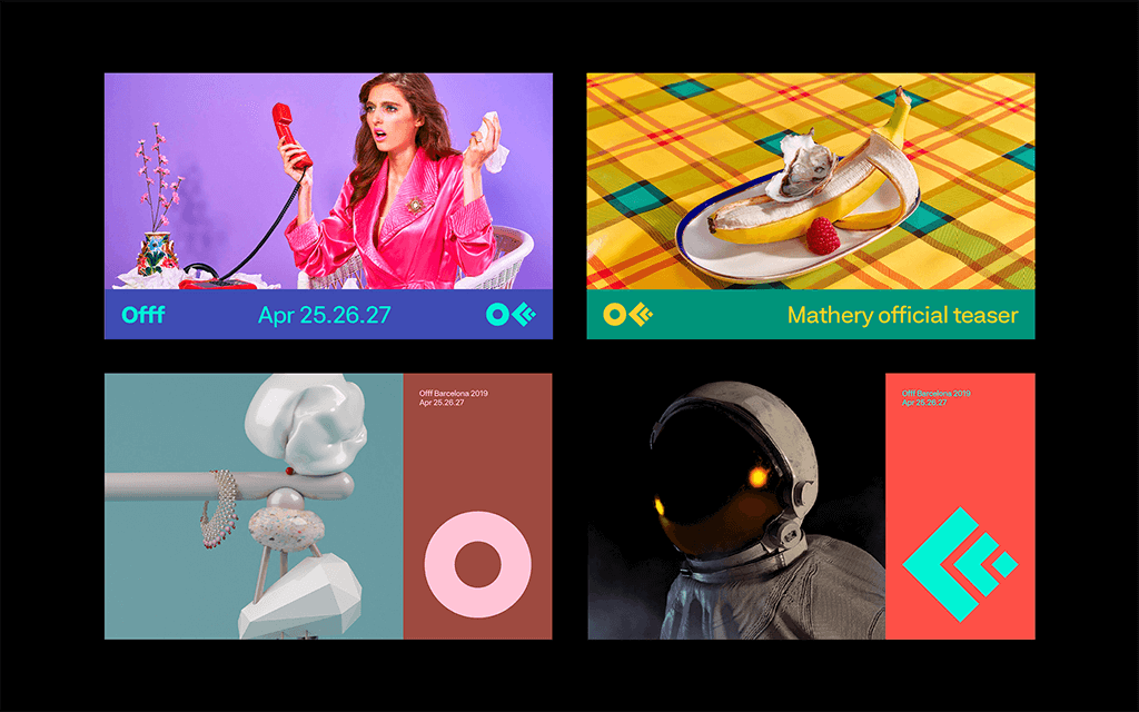
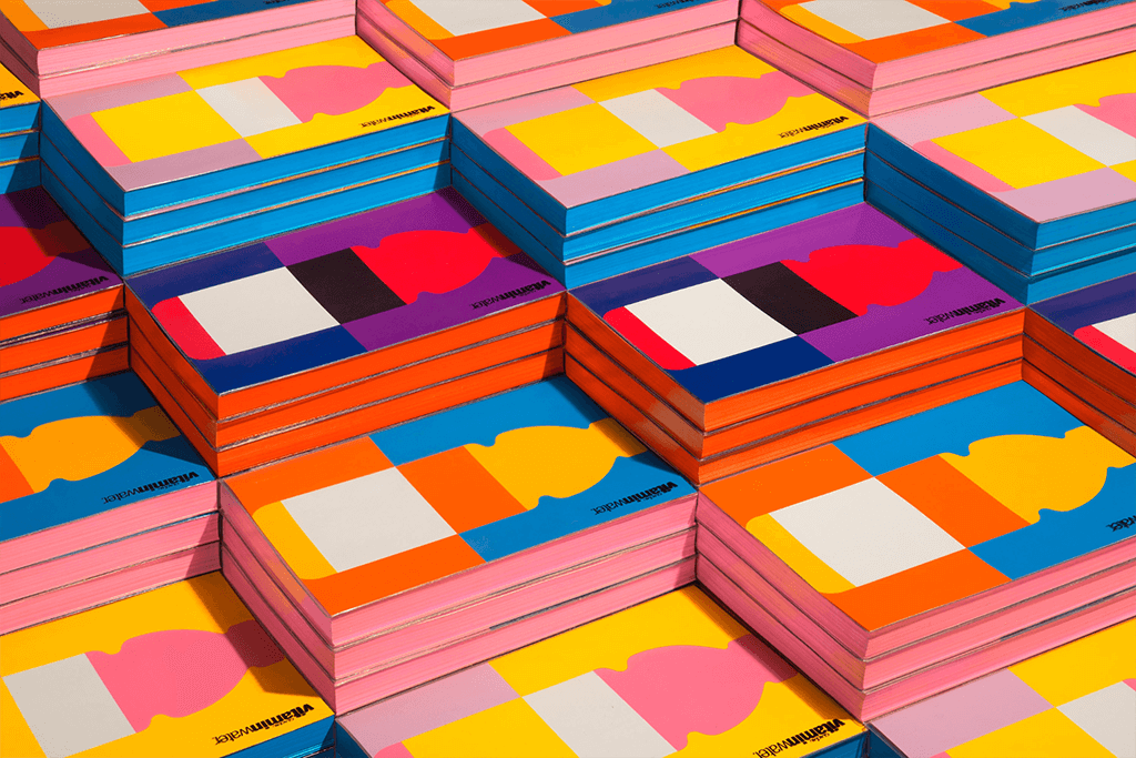
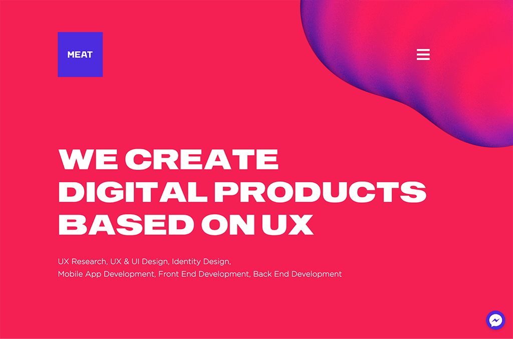
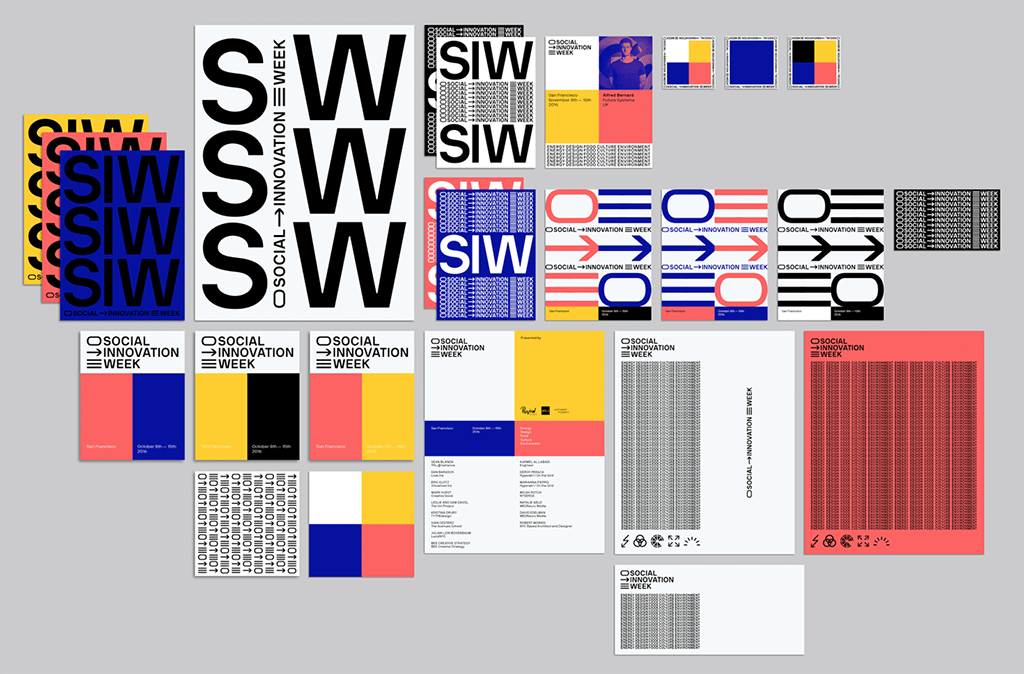
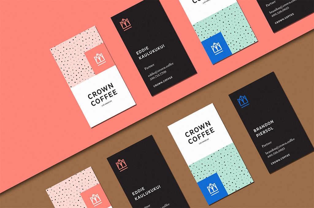
Bold and bright color palettes have become very popular and there are a few reasons why. Brands strive to stand out with packaging that leaps off the shelf and websites that make a big impression. So it’s natural that businesses have begun to gravitate towards unique colors and combinations that viewers haven’t seen before, and to create web designs that take full advantage of the color capabilities of modern screens.
Creative Combinations
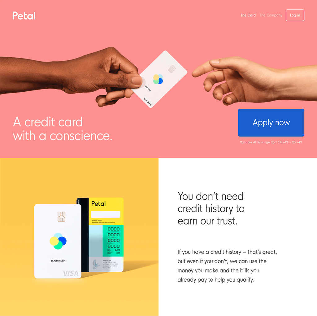
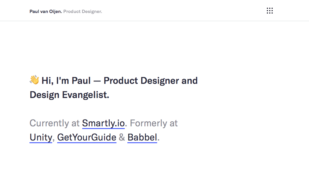
The Spotify-style image treatment introduced by the app a few years ago (two-tone images with a bright foreground and bright background) moved beyond the music and pop culture space and into the mainstream. More and more business in 2018 found that playful color palettes were a way to stand out and infuse their brands with fun and creativity.
Saturated Screens
Today’s digital devices are perfectly suited for showcasing these vibrant colors and bold visuals. Display technology continues to charge forward, and this is especially clear in mobile devices. Apple recently released a line of phones with Super Retina displays and Google technology boasts screens with a resolution higher than 500 pixels per inch.
As brands move to take advantage of the display capabilities on these devices, website visitors come to expect a colorful visual “treat.” If you’re looking to get in on this trend, try to expand your brand’s palette. Challenge yourself with a color or combination you normally wouldn’t, and most importantly: don’t be afraid to be playful and experiment.
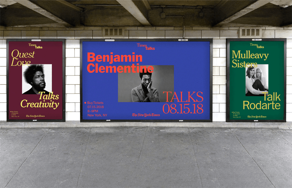
B - Brutalism
Another increasingly common web design trend is known as Brutalism. You may have taken notice of websites with unexpected or erratic layouts, less precision and uniformity, and fewer design details. Brutalist websites, with their unapologetically raw aesthetics and straight-forward features, presented themselves boldly all year.
Architecture and Art History
Brutalism was an architecture style and movement popularized in the 1950s, 60s, and 70s. Defined by powerful shapes and a disregard for emotional details, it is commonly known for eschewing ornamental flair for strength and utility through extensive use of materials like raw concrete.
Critics of the movement found the fortress-style buildings to be both overbearing and thoughtless, but for the architects and designers who practiced it, Brutalism allowed them to create architecture that rejected unnecessary decorations and create impact on a larger scale.
A Brutal Future
Designers have recently turned to Brutalism for inspiration and new ideas. It might be a reaction against skeuomorphic design with it’s superfluous details and faux-realism, or an attempt to find a new way to demand attention from increasingly distracted visitors.
In 2019, you can expect to see a lot more websites designed to be purposefully plain – presenting content clearly and expecting that users will know what to do with it. Brutalism will encourage web designers to not overthink website navigation or styles, hide nothing from users, and embrace simplicity.
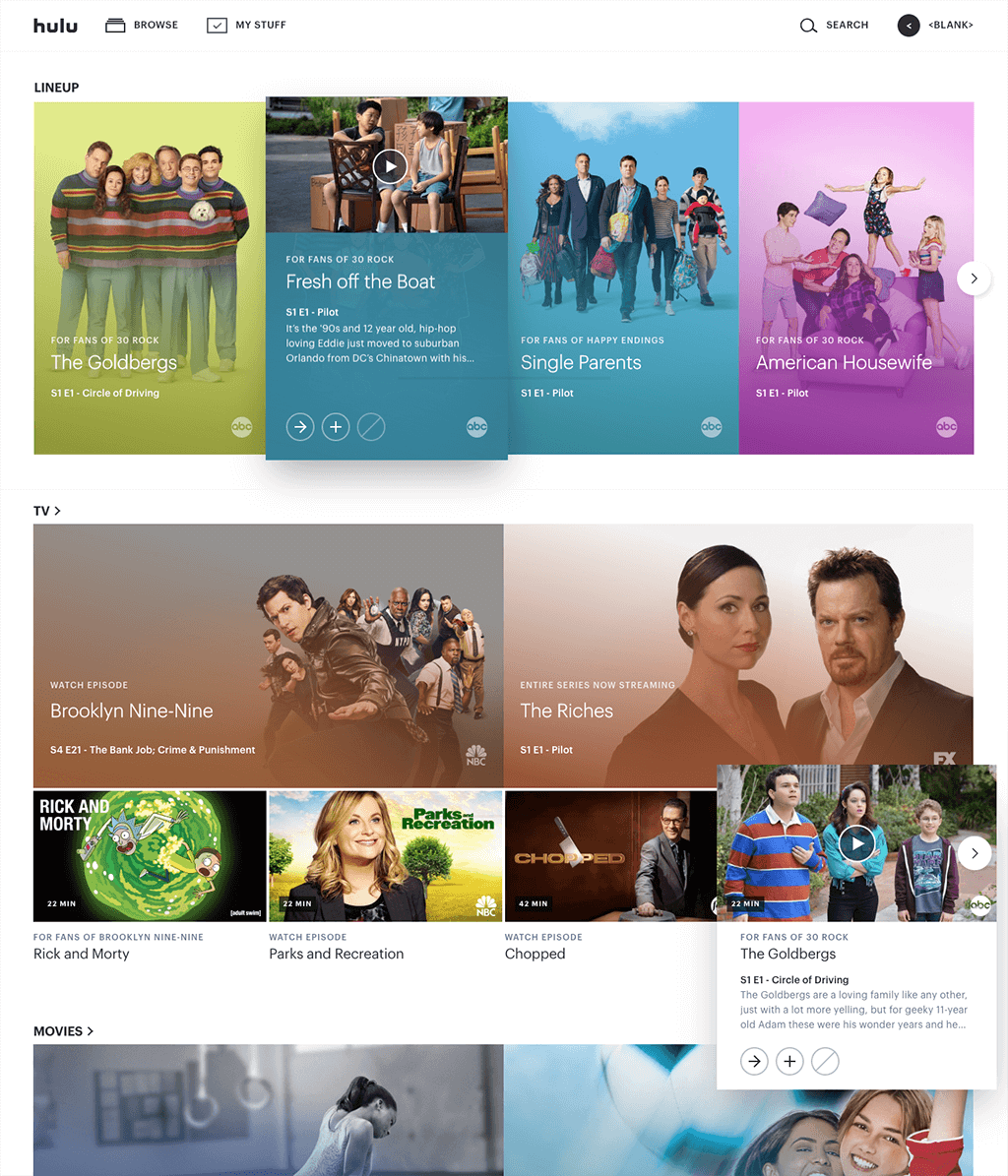
C - Cards
Cards as a UI element are nothing new, but the design patterns and stylizations really seem to have hit their stride this year. Small animations and subtle drop shadows combined with smart iconography and carefully crafted copy have culminated in fantastic usability for card interfaces on websites of all sizes. There are many benefits to using a card-based layout: Cards offer logical content organization options, they are familiar tools for website visitors, and they work nicely across both mobile and desktop devices.
Better Best Practices
Card UI use has been on the rise for years, as UX designers attempt to make interactions as intuitive as possible. UX Architect and Experience Designer Edoardo Benedetto describes cards as one example of “the many small steps towards a less visible UI” on his trends list. At Plaudit, we agree.
It’s In The Cards
Over the last 10+ years we’ve been able to research and test how cards perform in many different contexts. With those insights, we’ve established our own set of card UI functionality guidelines, and it has proven massively successful with our clients. Get in touch with us to discuss how we can help improve your website’s navigation and accessibility through the use of an optimized card interface.
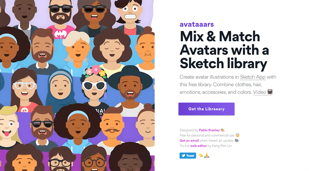
D - Diversity
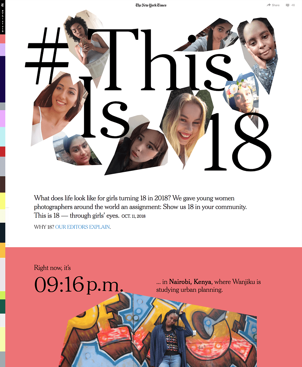
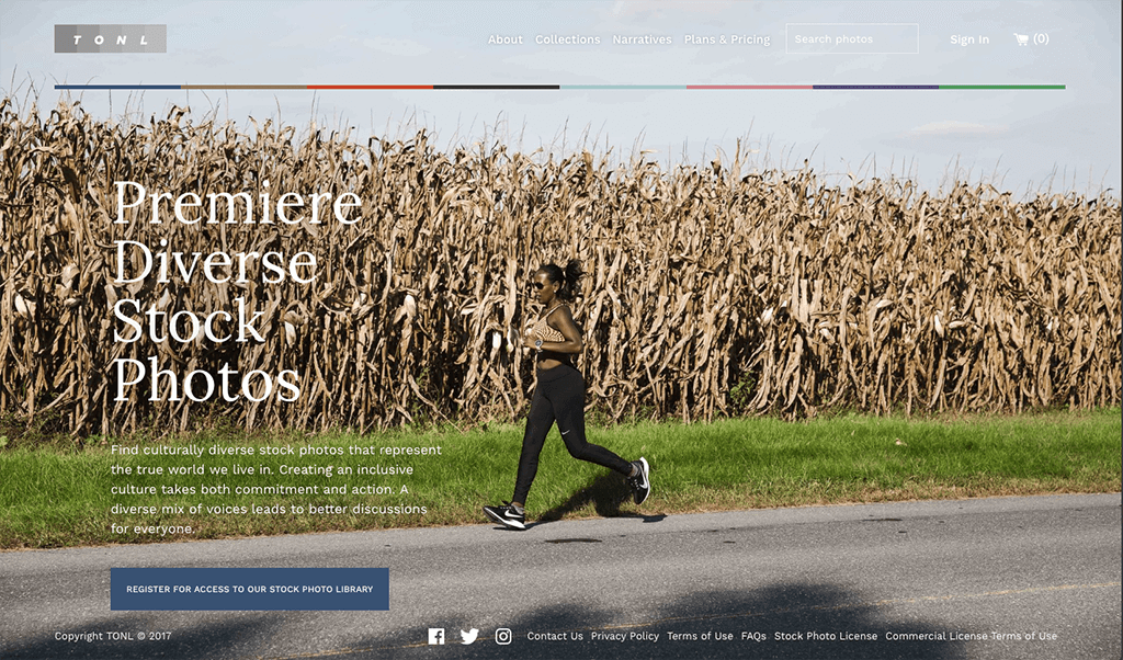
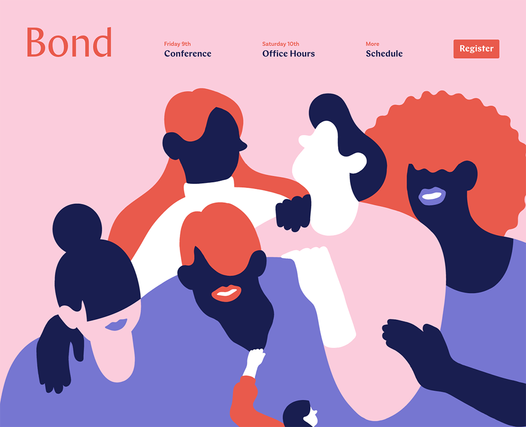
Diversity, representation, and inclusion are important topics to tackle in the design community, and the number of related articles, events, and conversations is on the rise. Additionally, many organizations – from grassroots neighborhood activists to global civil rights watchdog groups – are seeing the value and power that design can bring to their causes.
In 2018, people have found many ways to honor a commitment to diversity. Photos and graphics more commonly include different and sometimes under-represented groups of people, the design process more frequently includes consideration for the languages and customs from diverse cultures, and UX decisions are accounting for larger and more diverse audiences.
A More Connected World
Just over half of the world’s population used the internet in 2018, and in the US almost 9 out of every 10 adults uses it. As the number of people online continues to grow, the borders that divide countries and cultures shrink. With that change in how customs and ideas are exchanged, the need for more mindful, global conversations is clear. The work of web designers is a huge part of these conversations because the tools we create are used by an ever-growing audience.
Resources and Tools
Luckily, there tons of tools and resources that make it easier than ever to design for a more diverse and often global audience. Here are a few that we like:
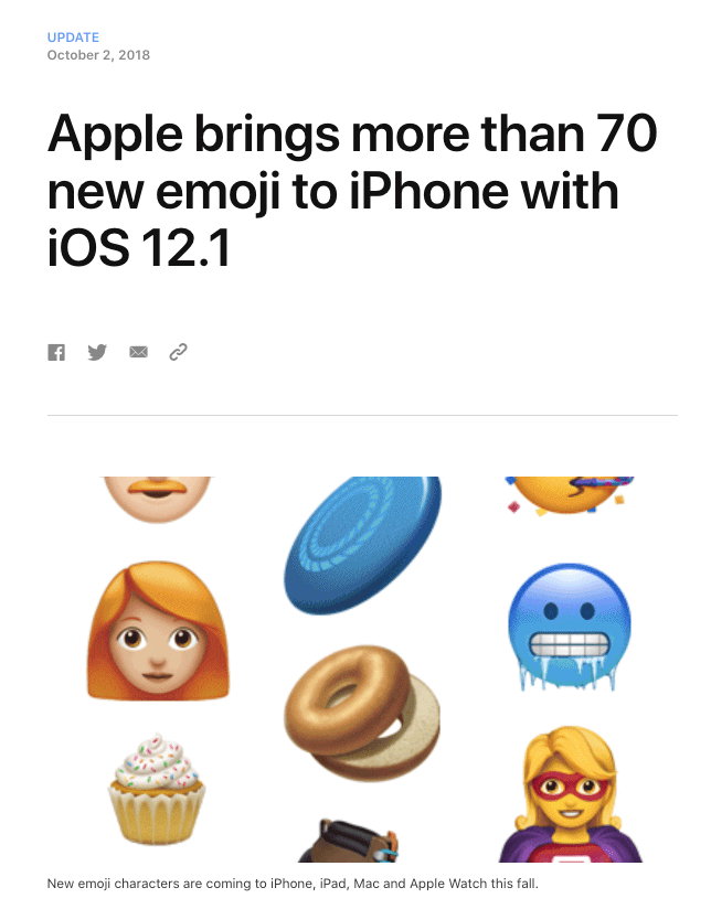
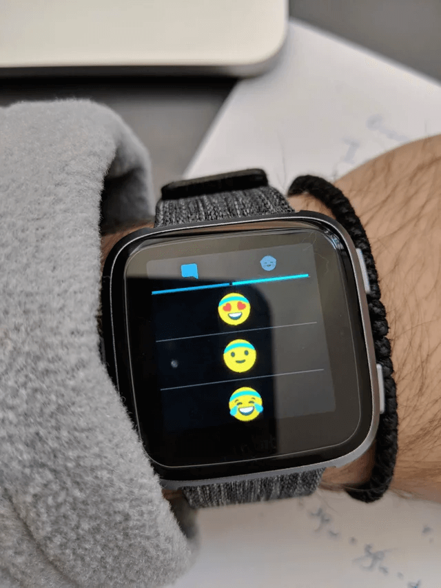
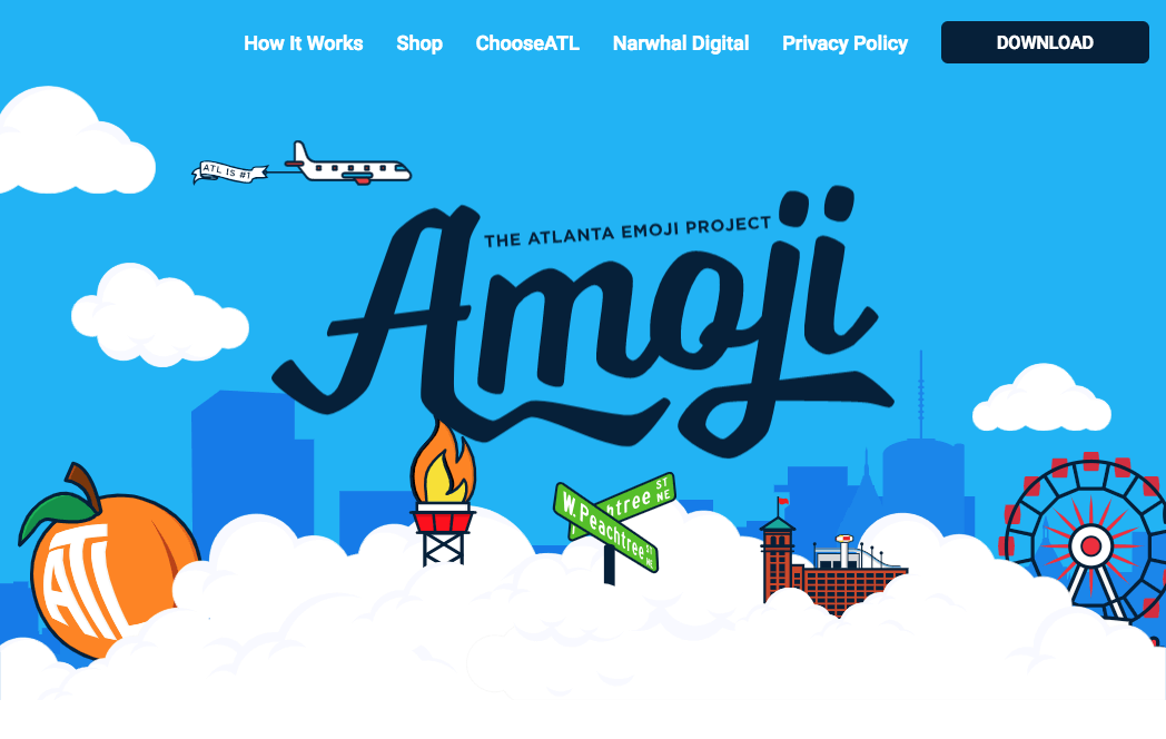
E - Emojis
Apple continues to add images to their expansive emoji library, and people are ready and willing to use them in pretty much every form of communication. For years, we’ve seen them all over text messages and Twitter feeds, and many social media sites have found value in creating their own custom emoji sets.
In 2018 though, emojis have truly taken over. The chat platform Slack allows you to easily leave an emoji reply to any message. Email subject lines are offering more and more support for emojis. And in 2019 we’ll see even more creative emoji use; pretty much anywhere they’re allowed.
Did You Know?
- There are more than 2,500 emoji options for you to choose from?
- Twitter made emoji easier to use in a tweet (they won’t count in the character limit)
- World Emoji Day is held on July 17
Emoji in 2019
On the off-chance you don’t currently use them, consider engaging with emojis in 2019. Find a symbol that can be specific to your brand, let them add a bit of personality and cheer to your content, or just embrace them in your texts, posts, and messages as often as you can.
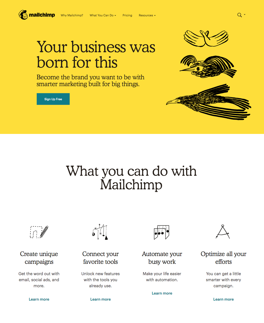
F - Flat Brands with Fun Details
As a culmination of some of the trends listed above, one style showed up nearly everywhere in 2018: flat logos and primary brand elements with unique, messy, and very human supporting graphics. Brands are increasingly integrating their own unique personality and character into their visual identity by simplifying logos, and infusing a personal style into the entire visual ecosystem. In 2019 more companies, brands, and websites will turn to this style as they look for ways to truly delight customers and visitors.
Tools of the Trend
Flat, super-simplified logos have been the norm for the past several years, but fun design details have been a welcome addition. These details can show up in many different ways, but some of the most common include: simple smiley faces, cute characters, crafty textures, hand-drawn elements, and (above all) messy shapes and cutouts. For some brands and websites these details are an essential part of the overall design.
A Fun New Year
All of these trends point to a very colorful, creative, and exciting 2019. Designers will let down their pixel-perfect guards and start working with more human design elements. Technology developments and new online audiences will open up new opportunities for communicating visually to people around the world. And we’ll keep looking for ways to inspire and excite visitors with great website experiences for years to come. At Plaudit, we’re always excited to explore the trends, tools, and technologies that help our clients succeed.